


The housing recovery has been struggling lately. Mortgage lending just endured it’s worst month in 14 years and analysts are projecting un unprecedented “triple-dip” in home prices. Household income has continued to decline and wage grown has remained poor for years.
On the other hand, the official “unemployment rate” just ticked down again to 5.9%, which equals pre-recession levels. Some of these important indicators seem to contradict each other which creates substantial questions. For starters, how can housing growth and mortgage applications remain poor while the unemployment situation appears to be improving? To understand these variances, a deeper look into the situation is required.
The “Real” Employment Picture
In a jobs market thats slumping for an extended period, a declining “Unemployment Rate” can actually be worse for housing than a higher unemployment level because a big portion of the rate reduction is due to people giving up on their job searches, rather than getting hired at a job. This creates substantial drag on mortgage applications because each person that leaves the workforce wipes out their mortgage chances for two years. Here’s what’s really going on with today’s unemployment rate.
Chart #1 – Civilian Unemployment Rate (Lower is Better)
THE UNEMPLOYMENT RATE HAS FALLEN. THIS SHOULD BE A GOOD THING FOR HOUSING AND THE ECONOMY, BUT THERE’S A CATCH.
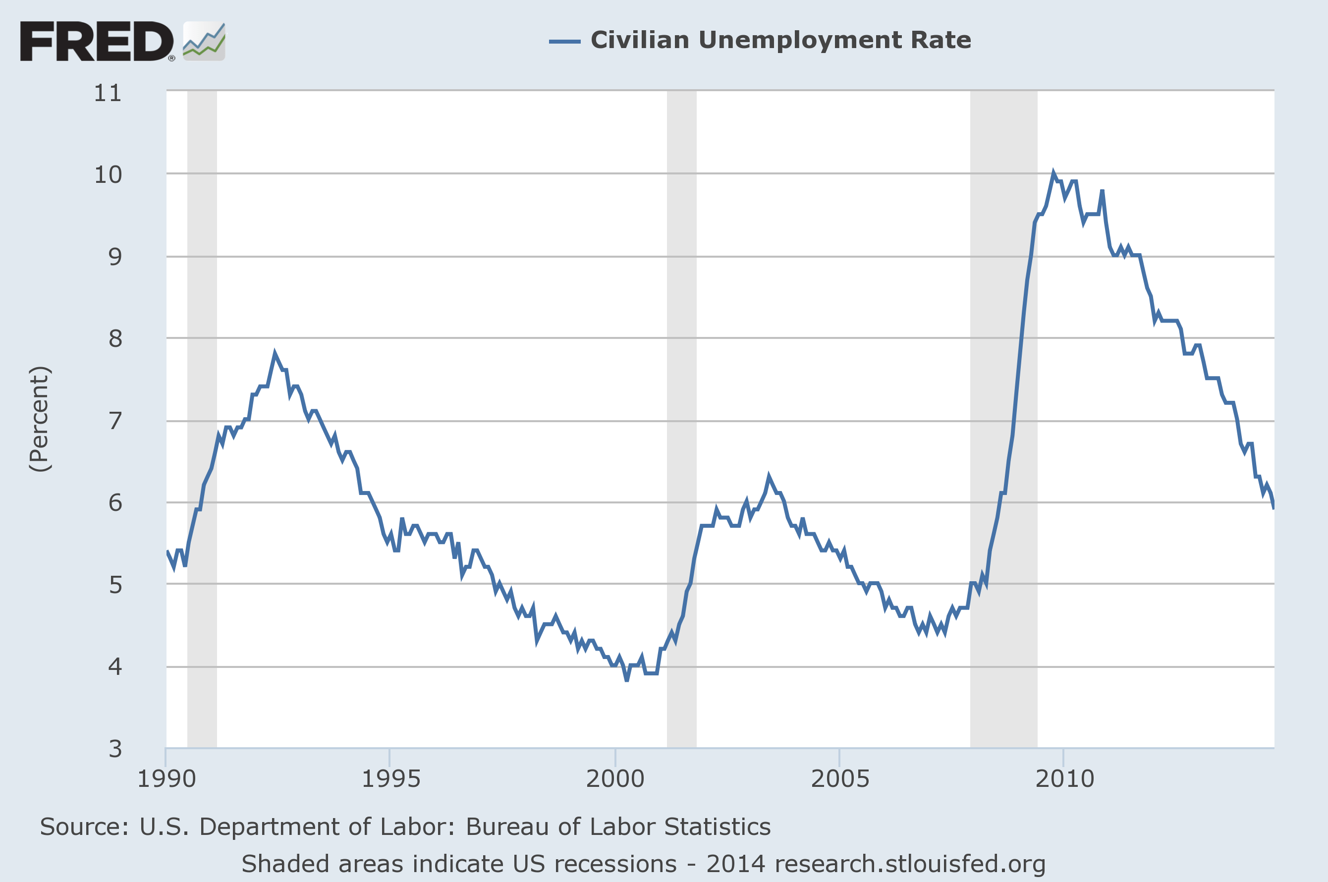
Chart #2 – Labor Force Participation Rate (Lower is Worse)
A DECLINING LABOR FORCE PARTICIPATION RATE MEANS LESS PEOPLE ARE WORKING. THIS CHART IS AT THE LOWEST LEVEL IN 36 YEARS.
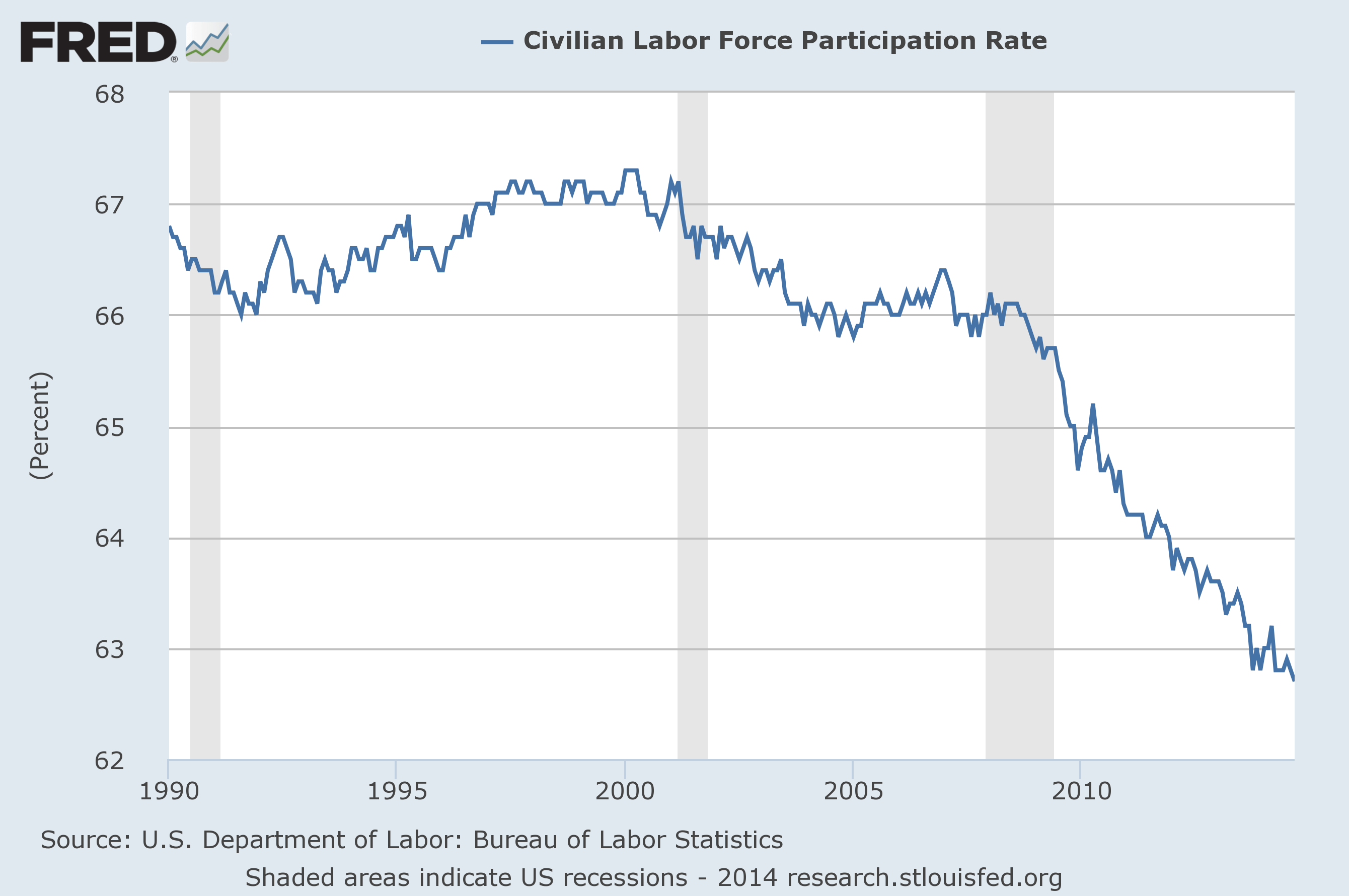
THE UNEMPLOYMENT RATE AND LABOR FORCE PARTICIPATION RATE BOTH DECLINED IN LARGE INTERVALS RECENTLY.
By comparing these two charts, it’s apparent how much the current unemployment rate is disconnected from the actual number of out-of-work Americans.
Why is there a disconnect?
 Under the today’s official “Unemployment Rate” formula, people are removed from the calculation when they either get hired or give up on looking for work. This is significant because a substantial drop of the labor force participation rate and unemployment rate at the same time clearly indicates a large numbers of discouraged unemployed workers giving up on their job search and leaving the workforce. Making matters more confusing, this anomaly is giving the appearance of a positive economic trend as the workforce shrinks in size.
Why Are People Leaving The Workforce?
The disconnect has grown so much that Keith Hall, the former head of the Bureau of Labor Statistics, recently stated that the unemployment rate is “misleadingly low” and the actual unemployment rate is about 3 points higher. In other words, the unemployment rate calculation was never meant to measure a jobs market stagnant this long and isn’t a reliable economic indicator right now.
A new calculation has been created to better capture labor market conditions!
In response to current disparities, the Federal Reserve recently announced the creation of a new index that reflects more of these variables . The “Labor Market Conditions Index” (LMCI) is reported to capture a “number” of labor market indicators. There may be a catch, however.
Wait… It mirrors the already misleading unemployment rate 96% of the time?
Carol Binder, a California economist, recently provided an analysis of the new LMCI on her blog that suggested the new calculation closely correlates with the current unemployment calculation. The similarities are so profound in fact that Binder wrote “They are almost perfectly negatively correlated–and when you consider measurement error you can’t even reject that they are perfectly negatively correlated– so the LMCI doesn’t tell you anything that the unemployment rate wouldn’t already tell you.”
I’ve seen the two charts on her post (halfway down the page) and I have to agree. The LMCI chart looks almost exactly like the Unemployment Rate chart turned upside down, and labor force participation doesn’t appear to carry a lot of weight. You can take a look and decide for yourself, the official statistics for the LMCI formula are published here.
In my humble opinion, any future labor market indicator will need to better account for the real percentage of out-of-work Americans to be considered a trusted resource. Anything less seems like more smoke and mirrors.


